

It started with eggs. After the recent bird flu outbreak, my grocery bills suddenly shot up. That got me thinking—how much does it actually cost to live alone in a U.S. city today? And how did that compare to a decade ago? I began digging into grocery inflation, but the question quickly grew bigger: Has the overall cost of living alone changed dramatically over the past ten years? And are some cities squeezing wallets more than others?
To find out, I built a dataset that tracks monthly living costs in five major metro areas—New York, Boston, San Francisco, Los Angeles, and Chicago—from 2015 through 2025. The goal: calculate how much a single person pays each month for rent, electricity, and groceries—arguably the three most essential urban survival costs.
First: Sourcing the Data
I gathered:
- Rent data from Zillow’s rental index
- Electricity price data from the U.S. Energy Information Administration (EIA)
- Grocery inflation (CPI) from the Bureau of Labor Statistics (BLS), specifically the “Food at Home” Consumer Price Index, broken down by metropolitan area
Each source provided data in a different format and level of granularity, monthly averages for some, bimonthly for others, and even quarterly in some cases.
Second: Cleaning and Normalizing
In R, I filtered and reshaped the datasets:
- For rent, I cleaned up the raw Zillow data, filtered to metro-level entries, and selected only the five cities of interest.
- For electricity, I used long-form price-per-kWh data by state, assuming it reflected urban trends.
- For groceries, I ran into a challenge: CPI data is an index, not a dollar figure. To estimate a monthly grocery cost, I assumed $450 was the average cost in January 2015 in New York, then scaled future values using the CPI index ratio. This allowed me to translate index movements into dollar estimates.
After converting all dates into YearMonth format for consistency, I used a series of left joins to merge everything into a single dataset per city.
And Then: Calculating Total Cost
With clean columns for:
RentElectricity_PriceEstimated Grocery_Cost
I simply added them together to create a Total_Cost column per month per city.

Finally: Visualization in Observable
To bring the numbers to life, I moved to Observable, a platform that lets you build interactive visualizations using JavaScript and D3.
- I uploaded my cleaned CSV.
- In Observable, I created a line chart to show the monthly cost trend over time, city by city.
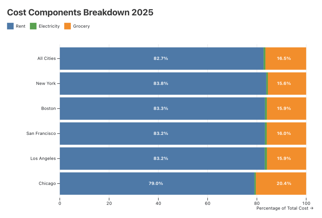
- I also built a stacked bar chart for 2025, breaking down what portion of living cost comes from rent, electricity, and groceries.
What I Found
- San Francisco and New York now top the chart, with monthly costs nearing $4,000 by 2025.
- Boston comes close behind, while Chicago remains the most affordable of the five.
- Across the board, rent accounts for over 80% of monthly expenses—except in Chicago, where grocery costs take a bigger bite.


Leave a comment